COVERT EXTRACTION


Logo and branding for a new, but undercover cannabis brand.

Cannabis use is mainstream, but Covert Extraction is a brand for the experienced and under-the-radar user. Their product line includes many different formulations that are often used in private, and we wanted the identity to reflect that and still be fun and curious. The branding leans into Constructivism and espionage themes of times gone by, with visual tones shrouded in smoke and mystery. I built this identity from the logo up, and our engagement has included projects ranging from package design to sales merchandise to landing pages. My responsibilities have included the design and art direction of all pieces, client coordination, and vendor management.

LOGO | BRAND DEVELOPMENT | PACKAGING | COLLATERAL

The primary Covert Extraction logo on top of a black background with smoke trailing up the center.
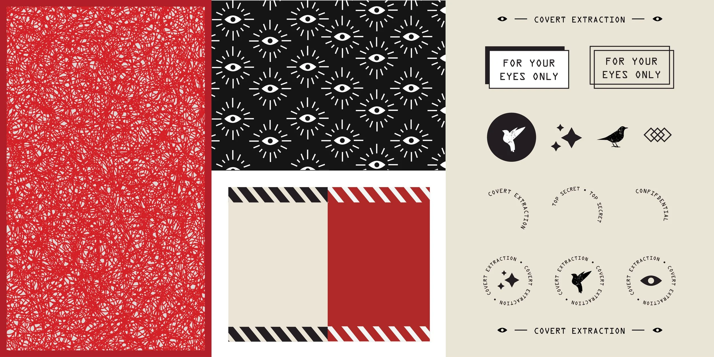
Elements of the Covert Extraction brand including badges, typographic lock-ups, eye ball patterns and red decoder texture.
Three posters showcasing different layouts and visuals used throughout the Covert Extraction brand.
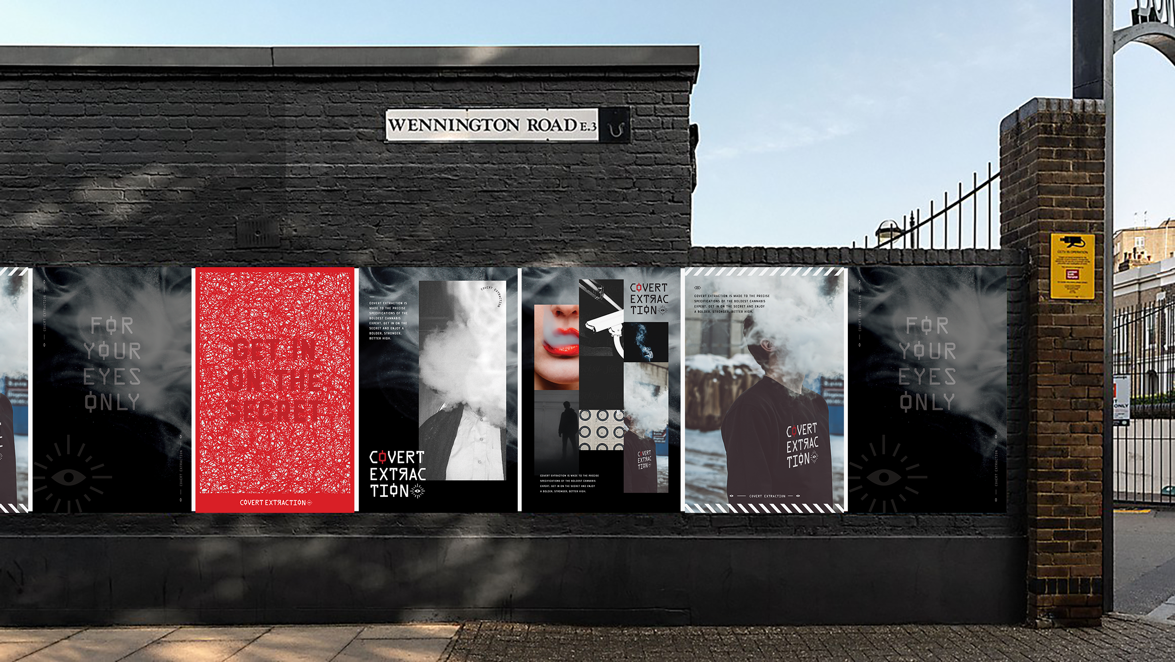
An urban street with posters pasted up on a brick wall featuring Covert Extraction cannabis branding.
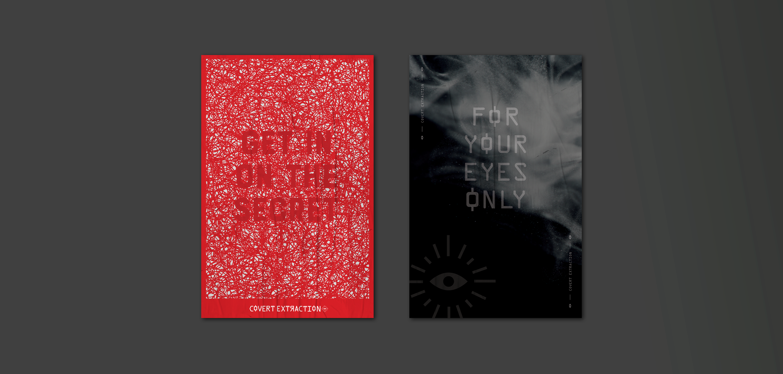
Two posters showcasing different layouts and visuals used throughout the Covert Extraction brand.
Mockup of matchbooks with Covert Extraction branding.
Mockup of a lighter with Covert Extraction branding - including the eyeball pattern.
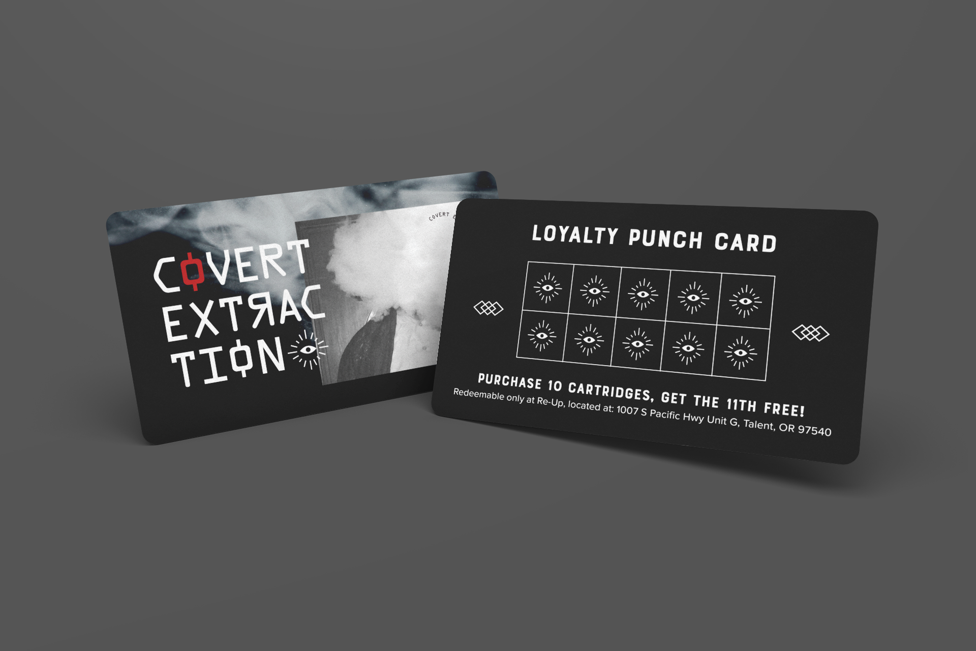
Mockup of a loyalty punch card for the brand.
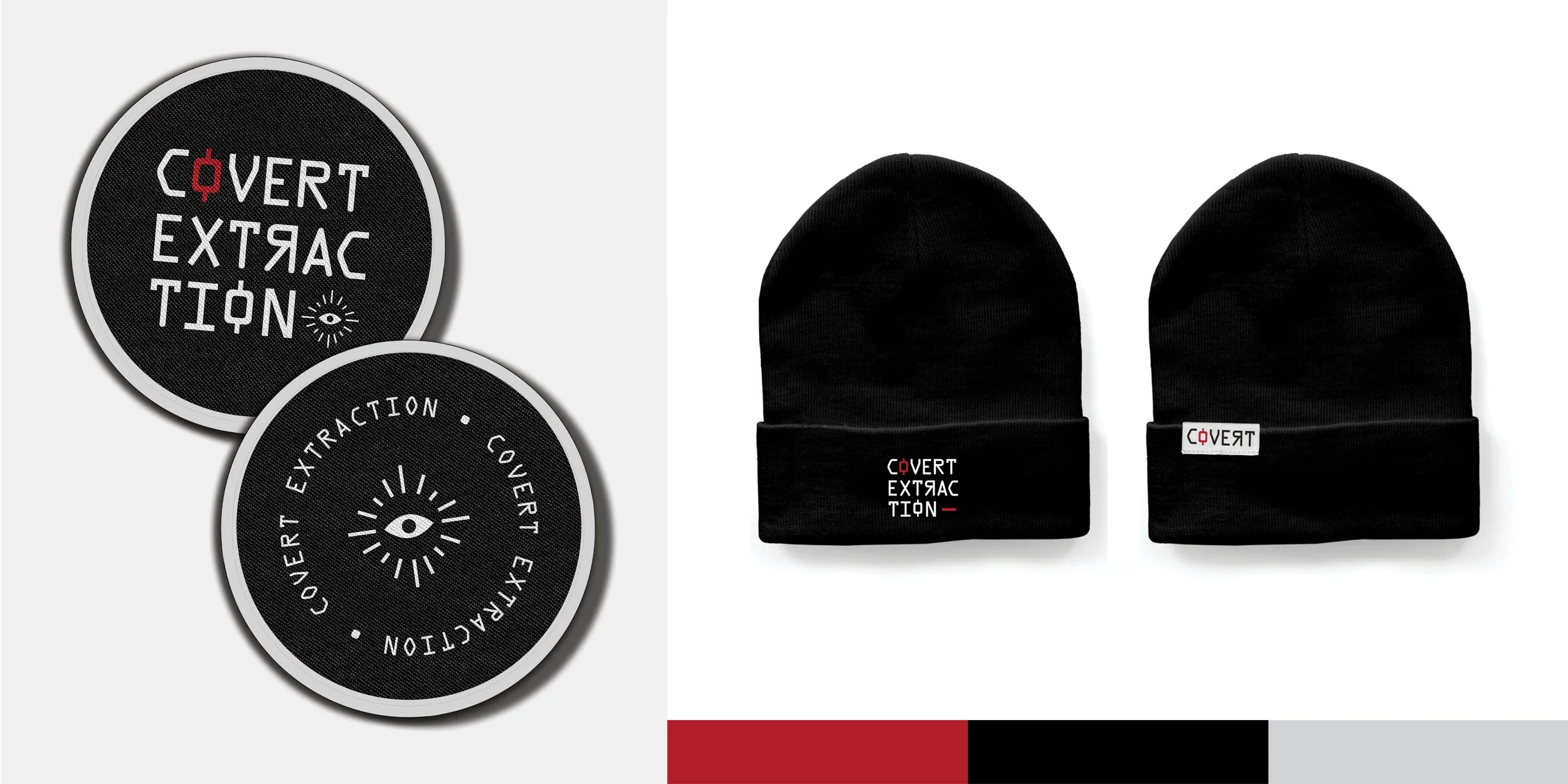
Embroidered patches and beanies with the Covert Extraction logo featured prominently.
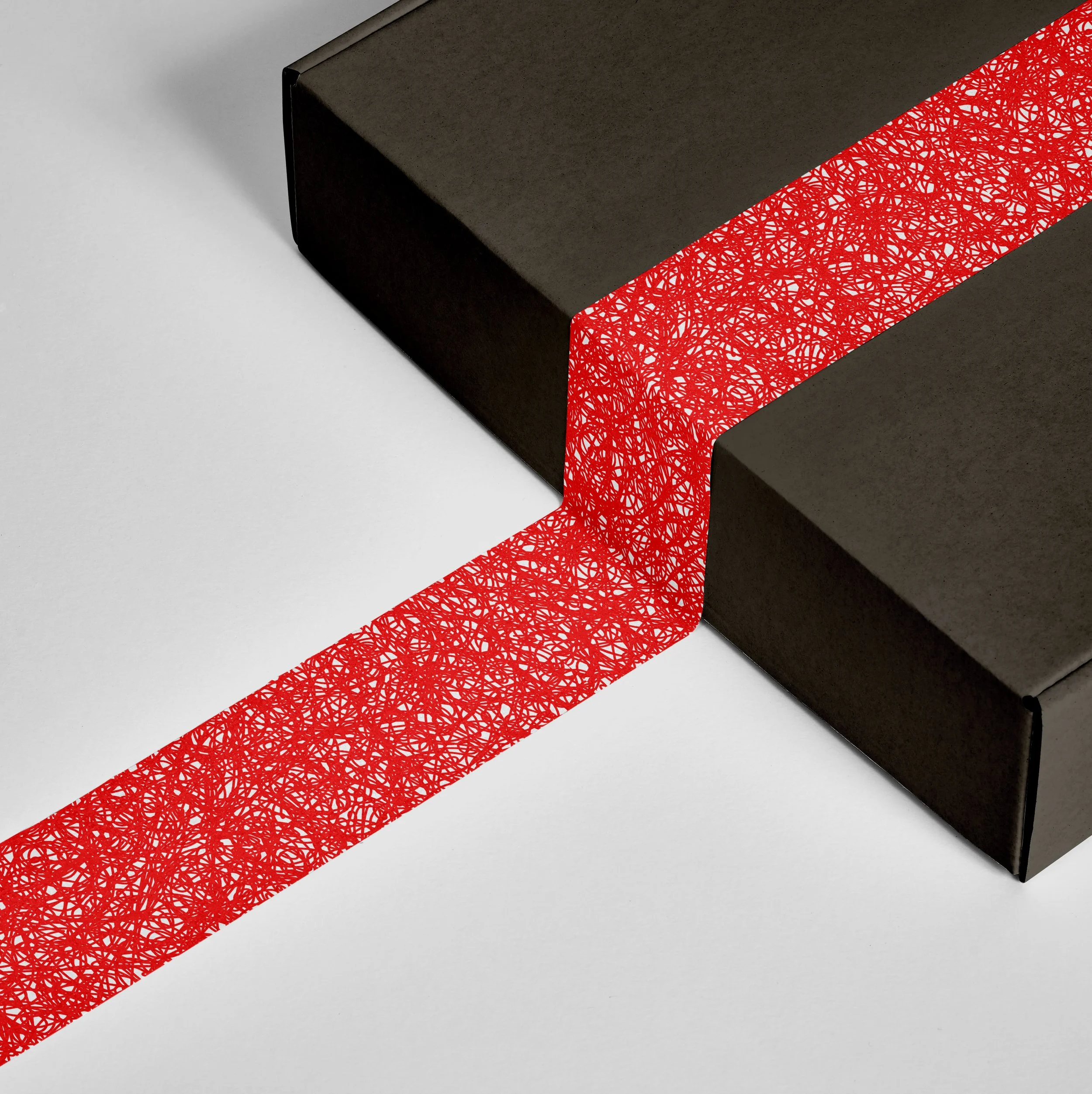
Custom packing tape - one example uses the red decoder pattern on a black box and the other uses various typographic elements on black tape covering a brown neutral box.

Previous Project:

Next Project: